HeroUI Pro logo

HeroUI Pro

Claim

HeroUI Pro is a premium UI component and template system for React and React Native teams, with production-ready building blocks, theming tools, and AI workflows.

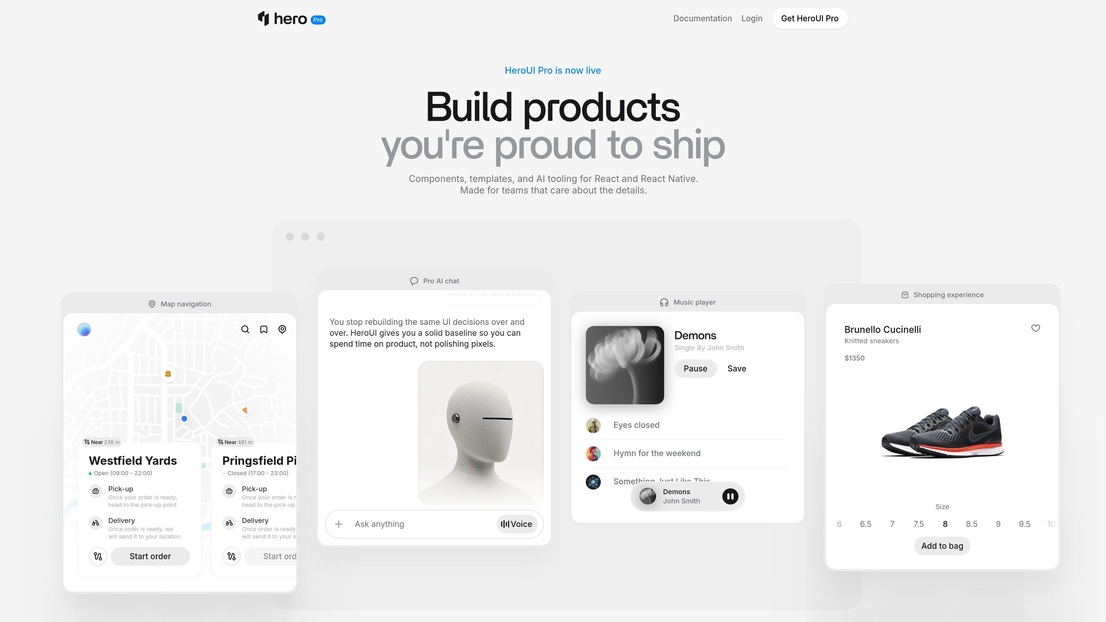
HeroUI Pro preview

Overview

HeroUI Pro is a premium extension of HeroUI OSS for teams building React and React Native products. It combines production-ready components, templates, themes, and AI tooling so developers can assemble application UI without starting from a blank system.

The site positions the product around practical shipping work: a shared design language from Figma to React to React Native, prebuilt pages for common app flows, and components that cover complex interfaces such as data grids, calendars, modals, charts, and chat experiences. The native and web offerings share a similar pattern-based approach, with new components and fixes delivered as package updates.


Features

Large React component set

The React docs list 64+ components and 465+ examples, including command palette, data grid, sheet, sidebar, emoji picker, charts, file tree, and KPI cards. These are positioned as production-ready building blocks rather than demos.

Ready-to-use templates

HeroUI Pro includes full-page templates for dashboards, mail, chat, and finance. The templates start from real application structure so teams can avoid blank-page scaffolding.

Theme system and visual builder

The product includes premium themes such as Brutalism and Glass, plus a Theme Builder that lets users create custom themes visually, preview changes in the docs, and export CSS.

React Native component library

The native docs describe React Native components such as Calendar, DatePicker, DateRangePicker, Stepper, SlideButton, ProgressButton, SocialAuthButton, and number input controls. The same design language and similar API are intended across iOS and Android.

AI workflow support

The product includes AI tooling: an MCP server, agent skills, and design-taste guidance for AI-assisted development. The homepage says these tools are meant to help agents produce interfaces with better defaults.

Design handoff and team support

Design files for Pro components and a theme variables sync plugin are listed for Figma, along with priority support options for teams and enterprise users.

Use Cases

  • Ship web app interfaces

    Use the React component set to build application surfaces such as command palettes, sidebars, data tables, modals, charts, and form-heavy screens without designing each pattern from scratch.

  • Launch app pages faster

    Start from dashboard, mail, chat, or finance templates when the product needs a full page structure instead of isolated components. This is useful when teams want to move quickly from prototype to working screens.

  • Build cross-platform mobile UI

    Use the React Native component library to create mobile experiences with the same design language across iOS and Android, while keeping the API familiar to the web team.

  • Align design systems

    Adopt the Theme Builder, premium themes, and Figma files when design and development need to stay aligned on tokens, variables, and visual style.

  • Support AI-assisted UI work

    Use the MCP server and agent skills when AI-assisted development needs to generate UI that follows the product's design patterns instead of generic defaults.

Pros and Cons

Pros

  • Covers both React and React Native with a shared design system and familiar API patterns.
  • Includes a broad set of production-focused components, not just showcase demos.
  • Offers full-page templates for common product areas such as dashboards, mail, chat, and finance.
  • Adds theme tooling, Figma assets, and AI-oriented tooling for a more complete workflow.
  • Regular package updates are mentioned in the docs, which suggests the product is maintained as a living component system.

Cons

  • The pricing page currently resolves to a 404, so buyers cannot verify plans or costs from the site content provided.
  • The evidence is strongest for the React and React Native docs, but integration details for broader workflows are limited in the collected sources.

FAQ

What is HeroUI Pro?

HeroUI Pro is a premium extension of HeroUI OSS. It adds production-ready React and React Native components, templates, themes, AI tooling, and design files for teams that want to ship faster without building UI patterns from scratch.

Which platforms does it support?

The source shows HeroUI Pro for React and HeroUI Native Pro for React Native. The React side includes web components and templates, while the native side focuses on mobile components with the same design system and a similar API.

How do teams typically use it?

The docs describe installation and then browsing components, using templates, theme builder tools, and AI tooling such as MCP servers and agent skills. That suggests a workflow centered on installing the package, choosing components or templates, and customizing the design system.

Is pricing listed on the site?

The source does not provide a published pricing table. The pricing page currently returns a 404, so only the existence of a pricing page is confirmed, not plan names or costs.

Quick Facts

Category
Developer Tool
Primary platforms
React and React Native
Source domain
heroui.pro
Product type
Premium UI components, templates, themes, and AI tooling
Pricing status
Pricing page exists but currently returns 404
Audience
Teams building production apps