
Ant Design-aligned component library
The main kit is built to mirror the Ant Design React component library, so screens in Figma line up with implementation instead of requiring reinterpretation later.

Ant Design System for Figma is a Figma UI kit for building Ant Design interfaces close to React, ideal for admin panels, dashboards, and data-heavy screens.
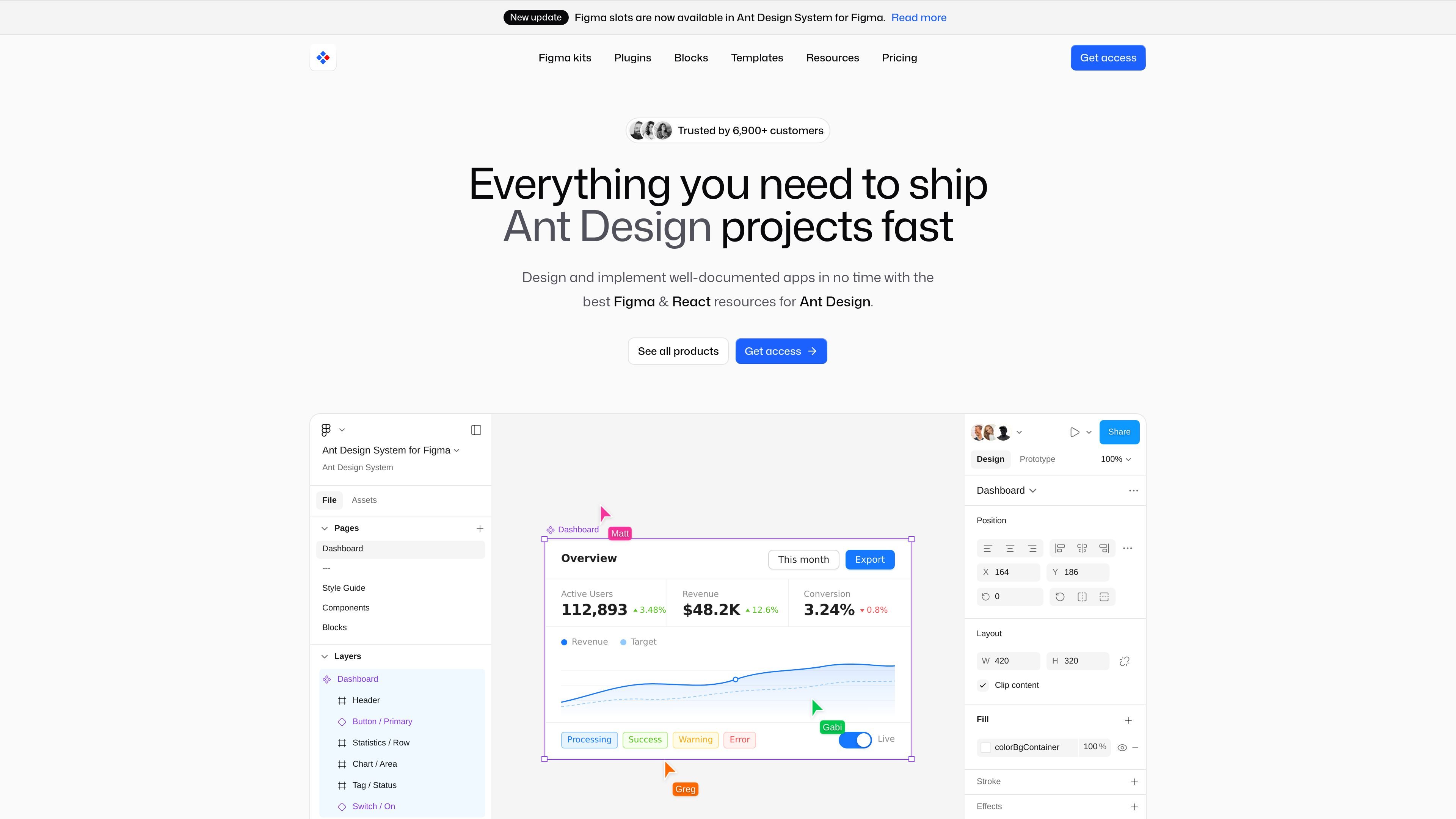
Ant Design System for Figma is a Figma UI kit and product design toolkit built to match the Ant Design React component library. It is designed for teams that want screen designs to stay close to implementation, especially for admin panels, internal tools, dashboards, and other data-heavy web interfaces.
The product combines a full component library, 800+ icons, blocks, plugins, and templates. Components use Figma Variables, Auto Layout, Variants, Slots, and Component Properties, and the Inspect panel adds React code references and documentation links so designers and developers can work from the same system.
The main kit is built to mirror the Ant Design React component library, so screens in Figma line up with implementation instead of requiring reinterpretation later.
Components use Auto Layout, Slots, Variants, and Component Properties to support resizing, states, and reusable patterns without rebuilding screens from scratch.
Variables control color, typography, spacing, and theme settings, including light and dark modes, with token naming that follows Ant Design JSON conventions.
The Inspect panel includes sample React code and links to Ant Design documentation, helping developers move from design to code with less manual lookup.
The library includes more than 800 icons at 24x24px, organized with search-friendly labels and the same React/code references used in the component library.
Blocks, plugins, and templates extend the kit with ready-made patterns, theme sync, and code generation for faster product workflows.
Designers can build admin dashboards, internal tools, and data-rich web apps with components that already reflect Ant Design patterns, reducing later redesign work.
Frontend developers can use the Inspect panel’s React code references and docs links to confirm how a screen should be implemented before coding starts.
Teams can use the blocks and templates as starting points for common product layouts such as dashboards, e-commerce flows, finance interfaces, and SaaS screens.
Design systems owners can keep theme values aligned across Figma and React by using the theme-sync plugin and token-based Variables.
Freelancers and agencies can use the kit, blocks, and templates to produce implementation-ready client work faster without building every pattern from scratch.
Yes. The product page says the Figma kit matches the Ant Design React specification, and the Inspect panel includes example React code and links to the relevant Ant Design documentation.
Yes. The kit uses Figma Variables for theme control, so light and dark themes can be switched globally without rebuilding screens one by one.
The pricing page lists one-time payment bundles that include lifetime access and commercial usage, with support response times varying by plan.
The product includes the core Figma kit, blocks, plugins, and templates across different bundles. The Ultimate bundle adds React blocks, Figma templates, and plugins for a design-to-code workflow.